BALANCE INNOVATIONS REBRAND
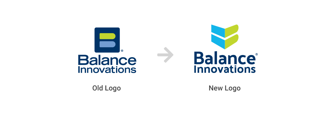
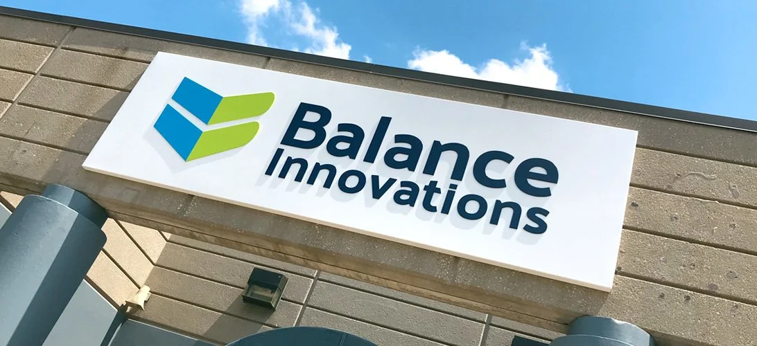
Balance Innovations needed to modernize their identity with a fresh logo that positioned them as a technology company, rather than simply a cash management company. The new mark uses 3D perspective with a stylized B one one side and an equals sign on the other. This was the perfect "balance" of calling back to their cash balancing history, while giving them a lighter, more abstract feel. This mark led the charge for a broader redesign of their entire identity and brand.
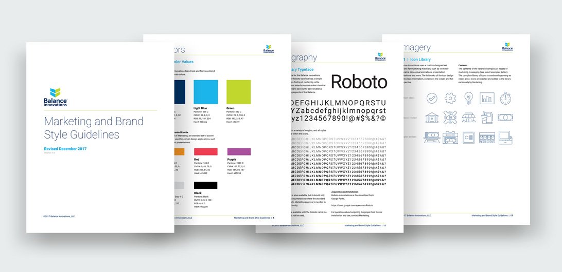
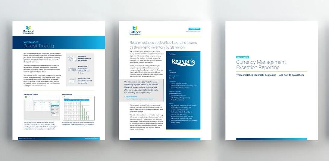
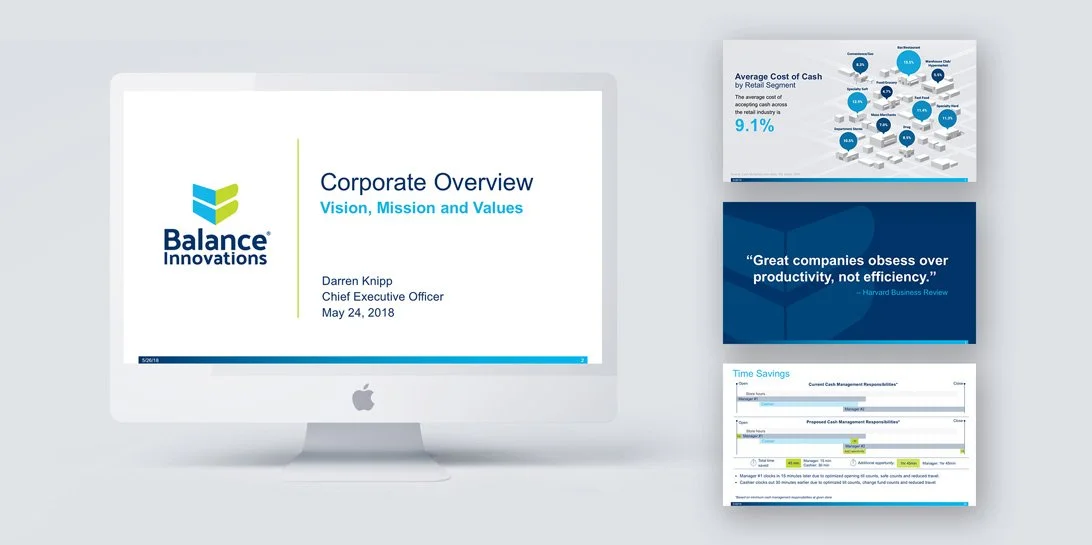
Balance Innovations not only need to rebrand their logo, but their whole identity in an effort to position themselves as a retail technology platform, rather than simply a cash counting company. I helped them do a complete overhaul of all visual assets, from corporate identity to collateral to PowerPoint templates to office signage, all encapsulated in a 42-page, detailed brand guide. Here’s a sampling of some of the new templates created.